The pandemic has been a great laboratory for new ways of working, moving from theory to practice at great speed. Remote working has been successfully introduced, facilitating the necessary and sought-after work-life balance, while saving on commuting time and the emission of noxious gases during the journey. In fact, only 4% of workers wish to return to work every day in the office, according to a study carried out by IESE and Savills Aguirre Newman a few months ago. Few, 14%, also want to stay in the office and telecommute 100% of the time, according to the same report.
Work has been transformed and so have the spaces where we work. Many companies have already explored ways to attract workers to the office with friendlier, more informal spaces and by prioritising their health and comfort. In 2022, we are following the same path in the design of spaces, always placing the end user at the heart of the strategy. What will be the characteristics of workspaces in 2022?
Flexible and adaptable offices to attract talent
Flexibility is probably the word that will influence space design the most in the new year. The flexibility of workers and their choice to work remotely will generate equally flexible and adaptable offices to attract talent to the workplace.
Sitting at one place during the same day no longer makes sense and, on the contrary, collaboration areas or spaces for interaction are designed. The new office aims precisely to help strengthen ties between people who spend little time together. This is the case of Swarovski’s new corporate offices, designed by the Grup Idea design team, in which the small offices distributed among different departments have been replaced by a single canteen-dining area. Here, informal meetings can be held and people from different divisions can meet. In addition, social spaces have been designed interspersed with open work areas and private areas such as offices or meeting rooms.
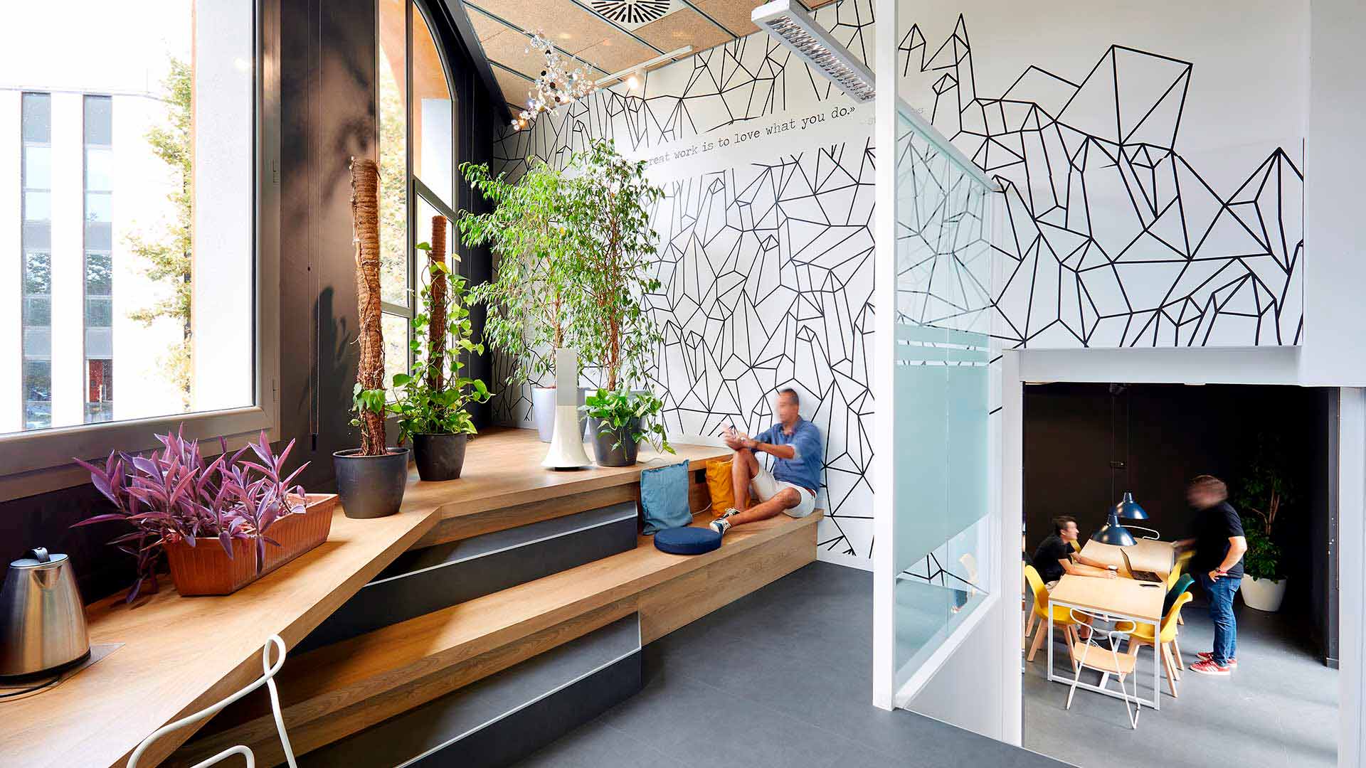
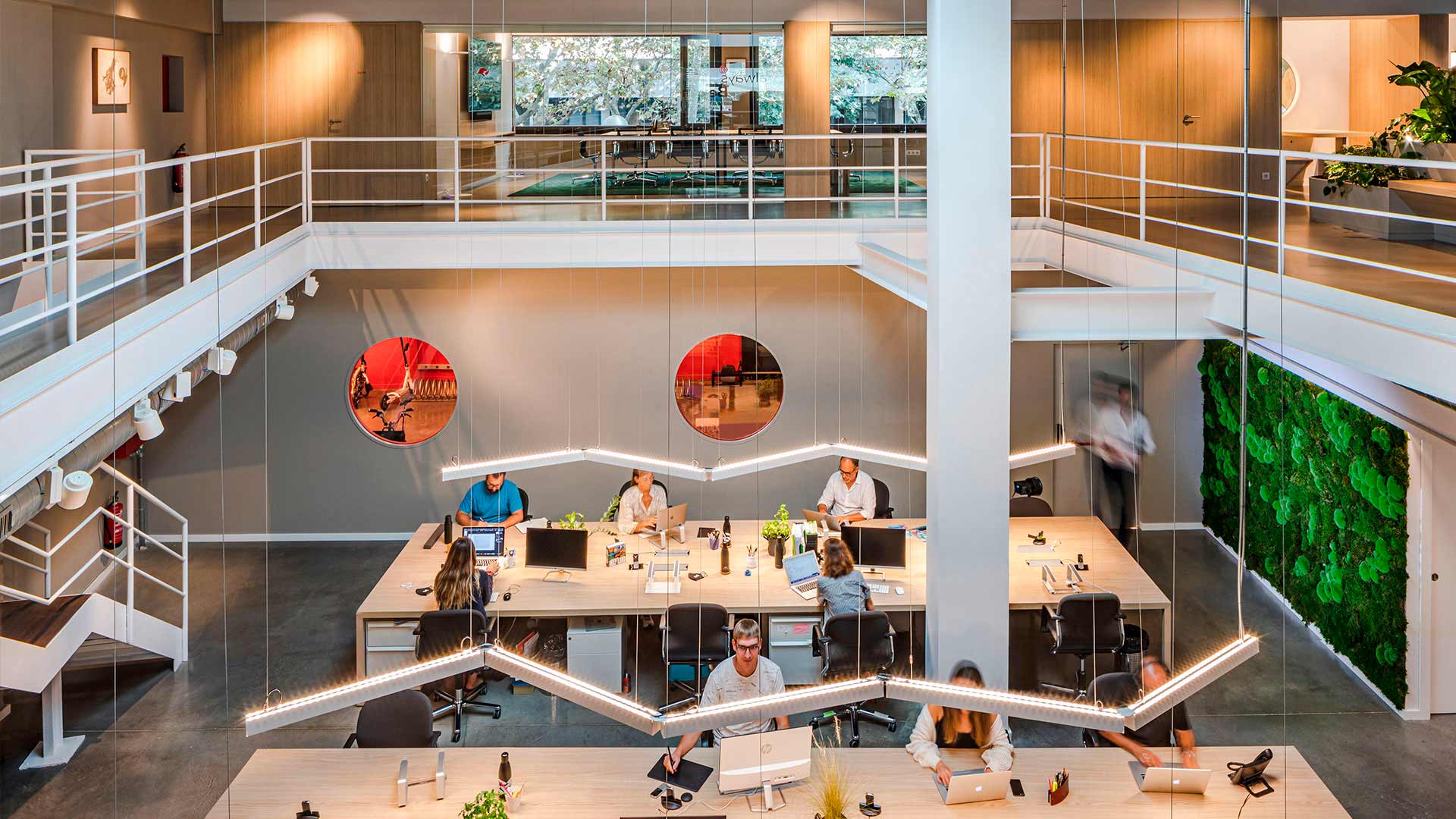
In the corporate offices of the branding agency M3 Morillas, a project in which Grup Idea and Abessis have carried out the project management and construction, the company’s strategic change had to take shape. The environments are organised through routes and conceptual spaces with varying degrees of privacy. In this case, the common thread between the three levels is lighting, with materiality, vegetation and colour. As its creator, Miquel Àngel Julià Hierro, tells us, “we are no longer talking about m2 of offices, but about m3 of shared creativity”.
Modern receptions for visitors
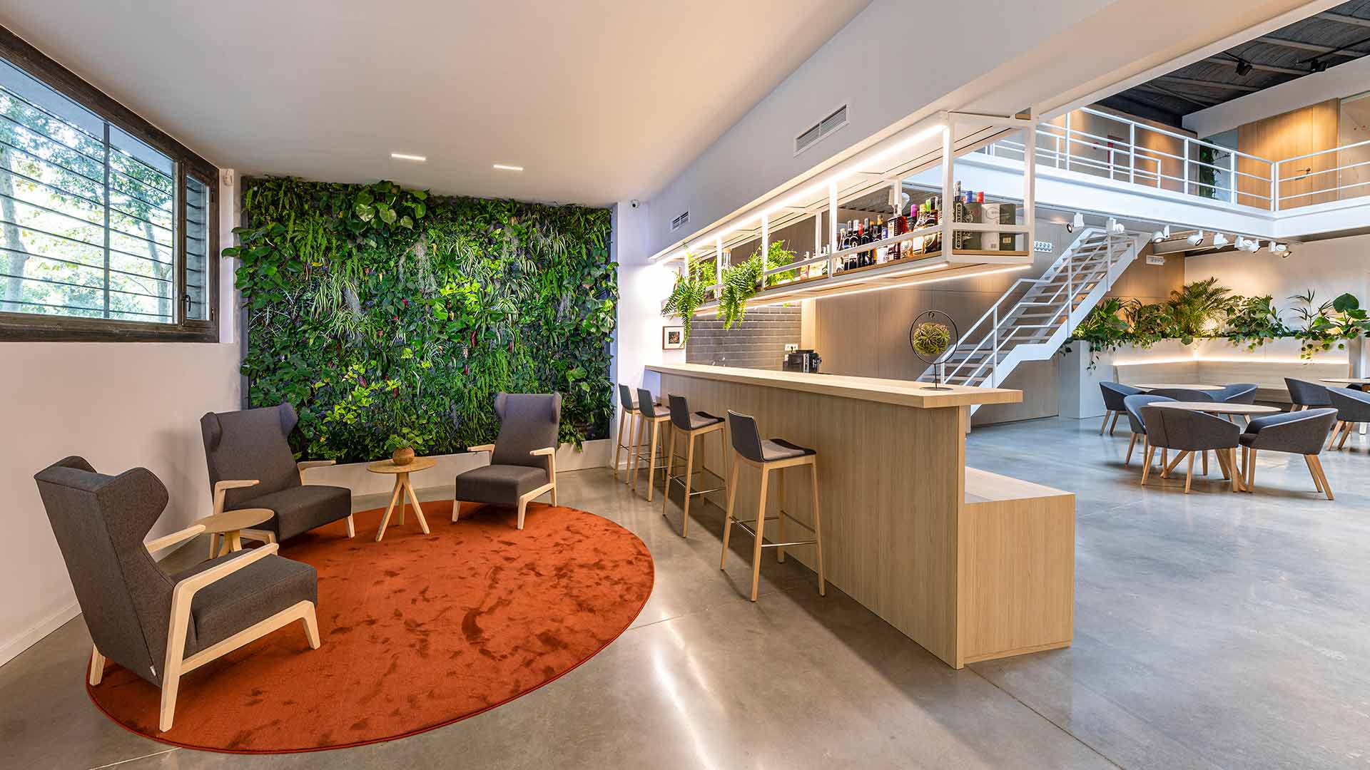
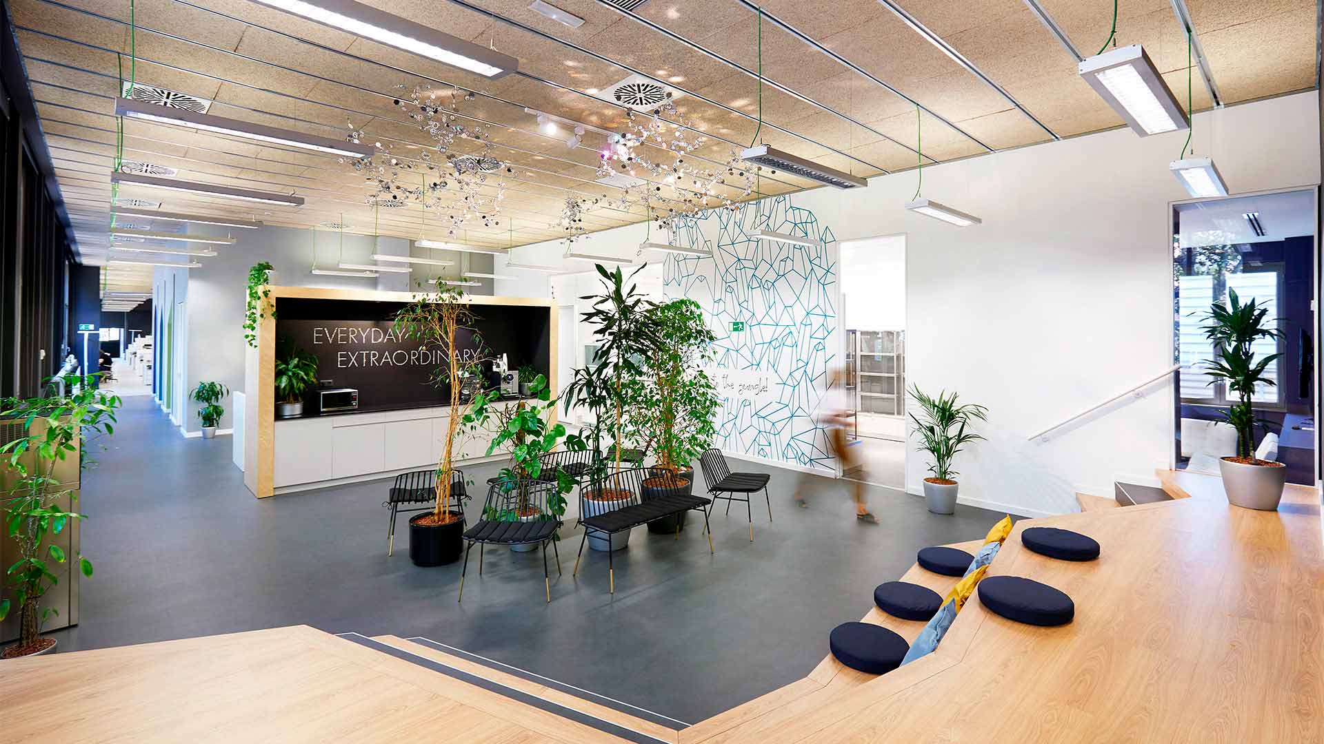
In the new office we are questioning spaces such as sales counters, which are often oversized and lonely. Instead, the trend is to incorporate lounge furniture or a small café as a meeting point for employees at the entrance. This creates a positive impression for employees and visitors and emphasises the vitality of the offices. Sometimes, as in the offices of Bank Degroof Petercam in Madrid or the new offices of Grup Idea in Barcelona, the interesting and necessary thing is to conceptualise the “non-reception” as the best place to be able to receive and attend to visitors. Because… Is it necessary to have a reception when the workplace is just another administrative post? Does it make any sense for that worker to be away from the rest of his or her colleagues?
More people-friendly and comfortable offices
Experience-based design makes perfect sense when it comes to conceptualising more comfortable and people-friendly offices. In addition to using air purification, water filtration, lighting, acoustic comfort and air-conditioning systems to provide a healthy environment for workers, pre- pandemic trends were already prioritising the health and well-being of employees in the workplace.
Generating comfort and a sense of value for employees through design
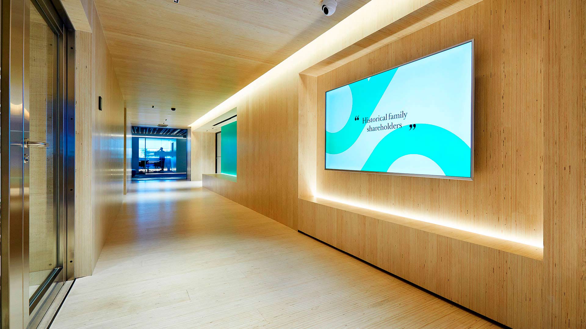
Well-designed workplaces evoke a sense of comfort and a sense of value for employees through materiality, texture or colour. To achieve this, as we have discussed, the strategy and design of spaces must place the end-user at the centre of the strategy. Some examples of good practice are the use of wooden elements to create textures, lighting adapted to chronobiological criteria such as circadian rhythm, or the incorporation of biophilia through active greenery. In addition to offering optimal comfort and improving the user experience, a friendly and comfortable office can increase individual and business performance and encourage creativity and innovation. In Morillas’ corporate offices, interior spaces are naturalised with the use of greenery in vertical gardens, a bench on the main floor or three preserved moss gardens on north-facing walls, among other applications. Apart from the benefits around health and visual comfort, the use of vegetation is also a good acoustic solution.
Architects and interior designers who design offices must ensure that going to work is much more than just going to a place to meet a timetable. The office should be a pleasant place to work with a purpose, to share experiences and knowledge, and ultimately, as Lluis Saiz tells us, to be able to savour the office.
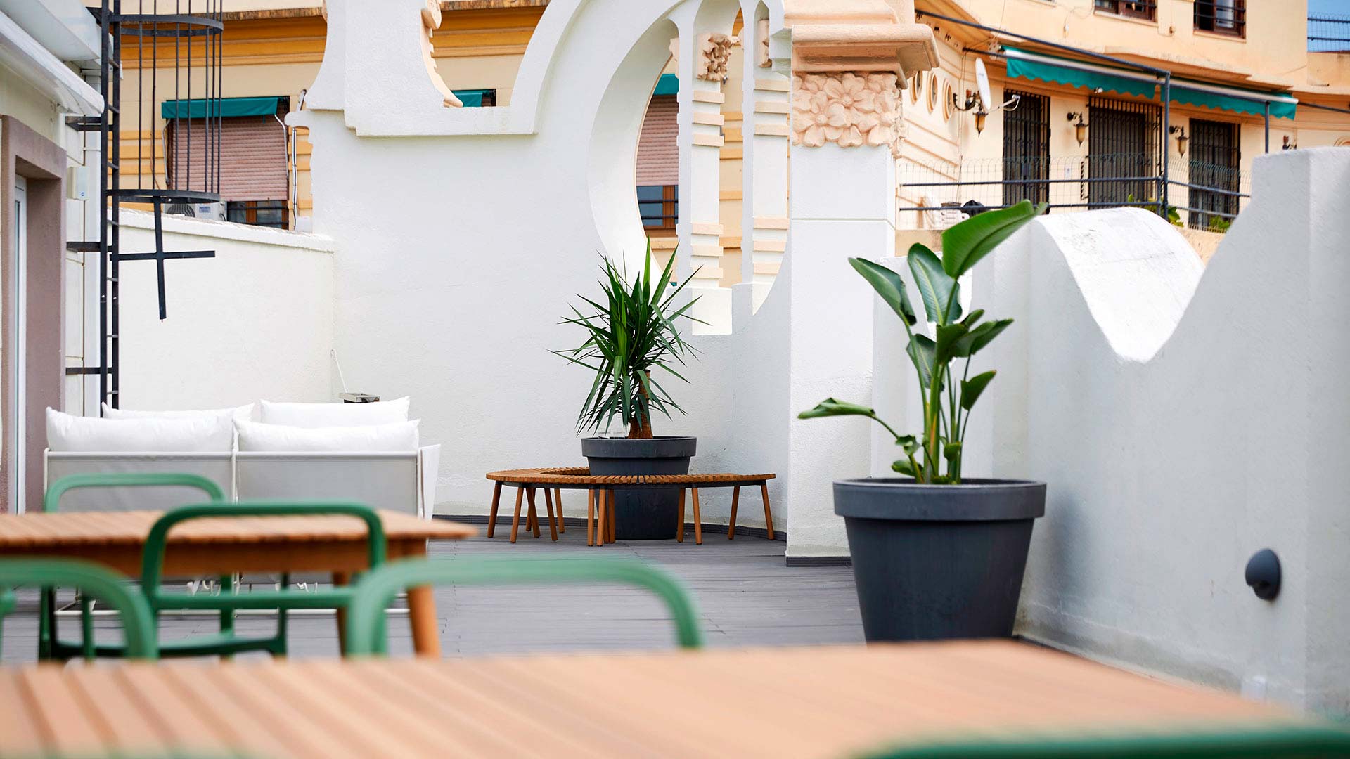
Hybrid offices to integrate teleworking
The workspace becomes hybrid, to integrate people who are outside, teleworking, and those who work face-to-face. Meeting rooms are equipped with technology, screens or mobile whiteboards to facilitate work and bring the digital and physical worlds closer together, what we call figital spaces. The next big leap that has already been announced by companies such as Meta (formerly Facebook, Inc.), Microsoft and NVIDIA is the metaverse, immersive and interactive collaboration experiences that will allow through mixed reality, augmented reality (AR) and virtual reality (VR) to work in the same virtual room. In this virtual room it will be possible to interact with digital avatars or experience directional audio. The ultimate goal is to achieve an immersive workplace.
Offices as a brand showcase
Offices continue to retain their institutional role as a space for customer relations and a showcase for the brand and corporate culture. The materials, textures, colour, lighting, identity and other construction details, as we have seen, generate a sense of value for employees but also transmit sensations and brand values. Also, the use of vinyls and architectural graphics help in the application of branding. In this sense, each project is unique.
We design collaborative, flexible and modern workspaces: get to know our methodology
At Grup Idea we specialise in the design of collaborative, flexible and modern workspaces. We involve the client throughout the design process, we listen to their ideas, needs and proposals and we carry out a joint analysis during the strategy and design definition stages. First, we carry out the study and analysis of the client’s business model, the development of the value proposition and the definition of the strategic brief. Secondly, we carry out the definition of the layout or space distribution study and the determination of costs in order to design a space tailored to your needs. Discover now all our office and corporate headquarters projects.

