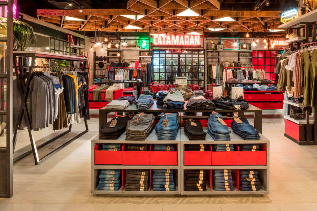
Retail is a holistic discipline. In it, everything is or should be connected. Therefore, it is not possible to talk about space design without taking into account furniture design and vice versa.
Specialists in the design of commercial spaces must know how to observe, analyze, compare and choose between different options. We must end up being the prescriber/designer of everything that makes up the space, the so-called Stage Box.
We achieve the functionality and usability of the store by knowing how to choose and/or design the details of all the equipment, not just the architectural space. Also the furniture, the lighting, the visual…
The Look & Feel, the atmosphere or ambience, and the “style” of the commercial space, depend on a previous strategy, on its tangibility through the interior design, but also of the furniture.
The design of the Scenic Stage not only consists of the definition of the container, but also of the content that fills it and gives it meaning. Both have the same importance. It is therefore necessary to make a leap of scale and to know how to work alternatively with the scale of interior design and product design.
It is a question of knowing how to choose and/or design displays, furniture and accessories in a transversal way with the rest of the works that will end up configuring the point of sale.
We conceptualize and develop every design to fulfill: Functionality, creativity and technique. We can make ad-hoc designs for a specific case or to be produced and marketed in series.
We can talk about the distribution plant, the generation of corridors, flows, vision lines and focal points … But we also have to talk about Furniture typologies. And the word typology is not entirely correct, but it is a good starting point.
We have to try to break with the corset of the world of typologies, both in space and in furniture, in order to be able to talk about new business models. Cashier counters, tables, pallets, counters, office furniture, islands of counters, islands, gondolas, exhibitors, mannequins,…. Supports, lattice systems, frames, furniture-window, built-in showcases, showcases-windows, wall systems, shelves, walls-shelf, niches, changing rooms, virtual testers, seats, built-in wardrobes, staircases, columns, mirrors, lighting…
But above all we must ask ourselves questions: Static or mobile furniture? Design of furniture and ephemeral displays, thought for seasons or for specific product campaigns? Should be an Incorporation and integration of the digital in furniture?
Perhaps it would be better to talk about systems, the flexibility of their accessories, variability, quality control, maintenance. For this reason, it is necessary to know how to look for materials and systems that are suitable in terms of durability, maintenance, compliance with regulations, etc.
Fastening accessories make it possible to improve product exposure and consumer accessibility. These can be standard, customized, or we can adapt/customize prefabricated accessories. For large chains, custom design can be more useful and economical. Everything depends on the quantity to be produced and the level of exclusivity sought. The accessories and their functionality can be evident. Even to be the protagonists of the space or on the contrary, to go totally unnoticed.
Exhibitors in turn can be used to transmit brand. All this is not a matter of aesthetic taste, but depends on the strategy proposed at the beginning of the project. The Retail strategy involves specific furniture and a specific distribution of it. For this reason, as designers we must work hand in hand with the retailer. The concept of design is necessarily linked to the concept of business.
It is obvious that in Retail projects, we have to put the consumer/user at the centre. But in turn we must talk and give the necessary prominence to the merchandise. When I speak of merchandise, I am referring to the products that are displayed and sold in the store. Of their dimensions, quantities, form of organization and presentation (hanging, folding, packaging, …) All of them are some of the variables to be taken into account when defining furniture. Also the way of presenting the product…
Is one unit of each product displayed and the rest of the stock is in the warehouse? Or are all sizes or sizes and colours displayed? Symmetrical or asymmetrical presentations? Anatomical presentations? Grouping of different products but with the common thread of lifestyle? At this point retail has a lot of museography.
We can talk about the concept of “Sensorial Ergonomics in Retail“. The five senses participate in the design of commercial spaces. But touch, apart from sight, is essential in furniture design, as it is the element closest to the consumer. For this reason, it is necessary to speak in a formal way. And so we must ask ourselves once again whether Louis Sullivan’s assertion is still true: “Form follows function”.
And at this point, let’s talk about “Brand Material”. When I speak of this concept, I intend to encompass subjects on which to work from a different prism than usual; such as materials, textures, the use of colour, lighting, the identity of the brand, constructive details, fixations… Because matter, what we see and touch, also conveys sensations and brand values. Choosing the materials that make up the furniture, using a chromatic palette and textures that, together with the stage box, allow the brand image to be projected. All this is also part of the universe of what should be a new discipline in the Retail value chain; that of “BRANDING MATERIAL DESIGNER”.
Miquel Àngel Julià.
Director de estrategia y diseño en Nuklee
Retail actual – La importancia del diseño de espacios y mobiliario en el punto de venta.
Ver más sobre Ergonomía sensorial en Retail.


